Where sports go, graphic design is not far behind. From big scale branding of major pro teams to the design of your local little league logo, there is someone behind the scenes, utilizing imagery to delineate teams. And that goes double — nay, infinitely multiplied – for products available to consumers of sporting goods.
But where you may not associate a specific style with many sports, there are certain standouts that have distinguished aesthetics all their own. Like, let’s say, snowboarding. A sibling to other aesthetically dominated past-times like skateboarding and surfing, with snowboarding we see an entire style built around an industry.
From bright colors and dominant graphics covering everything from the board to the clothes to the gear to the stickers affixed to those previously mentioned boards, clothes, gear and everything else in between, you can’t deny that this particular sport has created for itself a serious dedication to design.
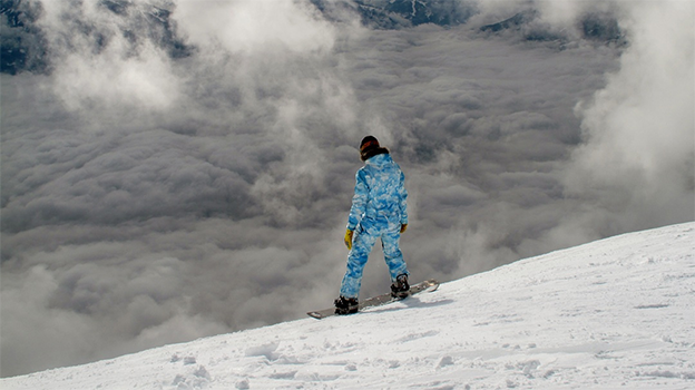
And while many consumers may focus on the functionality of the gear they purchase, the creators cannot overlook design as an important selling point. And a lot of decision goes into these patterns.
Take for example, this quote from Niche Snowboard’s creative director Ana Van Pelt for Outside Online, on how she helps her brand craft top-notch boards:
“Each season, I spend a solid month creating a style guide that provides direction for each graphic individually, and how the line will come together as a whole. It gives details about color pattern, palette, themes, and emotions; I’ll create a mood board of imagery that encompasses all those things. I typically have an idea in my mind of what I want the line to look like overall, as well as very specific graphic ideas.”
Clearly, something is working with Van Pelt and other creatives’ work, because the boarding industry is producing some amazing things right now. As a dedicated groupies of the board-based artwork, here are our top five snowboard design trends for 2016 we expect to see.
1. Tearing
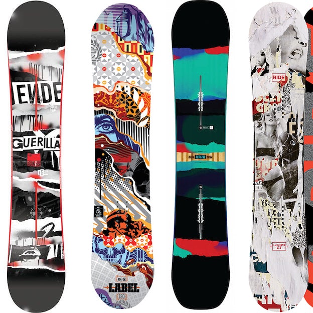
Or should we say, (paper) shredding? Collaging isn’t an unfamiliar practice in this design medium, with creator taking inspiration from different sources and patching it together on the bottom of their boards.
But we like the physicality of this rendition of the snowboard design trend, with frayed edges and hints of pop culture or color, a hark back to the more analog days where snowboarding has its roots.
2. Totems
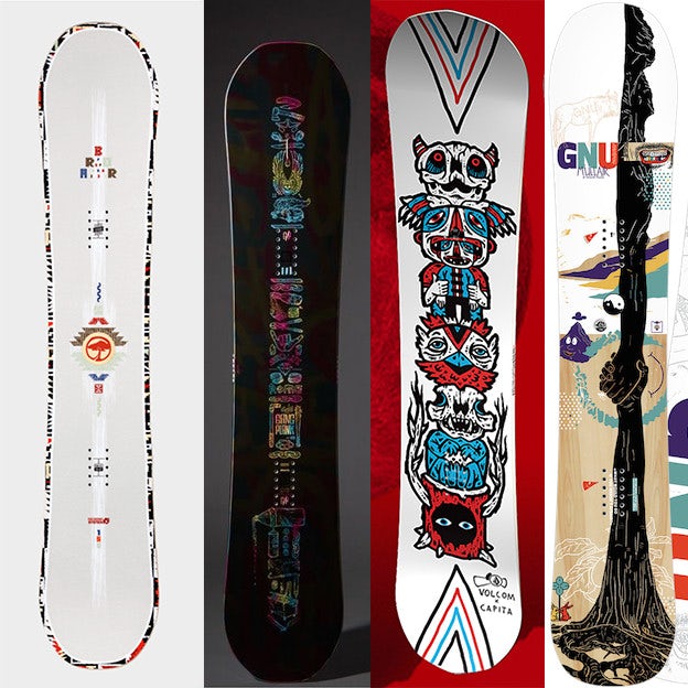
The snowboard is a very strange and specific shape on which designers need to fit their concept. And over the years with the thousands of boards that have come out, people have found a ton of ways to use the space. But right now the trend of a long, unified graphic down the middle of a fairly simple board has caught our eye — whether it’s literally totemic or just reminiscent of that figure.
3. Outer space
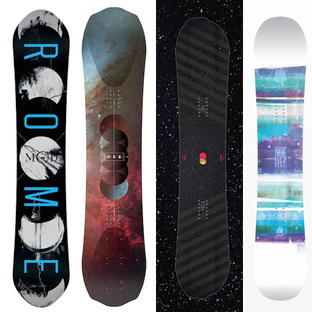
Space as a way to capture the spirit of boarding — a sport searching for a thrill and freedom, with players always in search of a new frontier. And where bigger and better to go than the coldest and most undiscovered place of them all? Who knows what kind of mountains await our track on planets far away?
4. Shades of Anaglyph
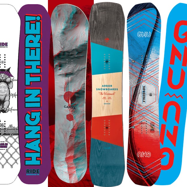
Snowboard graphics have rarely shied away from the use of bold and bright colors, and the common mash-up we’re seeing this year amongst the oranges and lime greens, is between red and cyan. A hark to the Anaglyph 3D, where you put a set of paper glasses on with one red and one lens and see the world pop out at you.
5. Tattoo
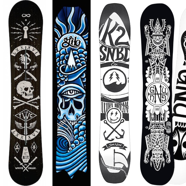
Illustration has long been an essential part of the aesthetics of snowboards, with big brands importing illustrators of all kinds to help them create a signature look. This year we’ve been seeing a lot of designers sampling the old school classic tattoo look for their work.
Considering the similar themes you may find between the two industries (cough, cough, rebellion? cough), it’s fun to see what results of this exchange of creativity.

Оставить комментарий
Вы должны быть авторизованы для комментирования.