Описание
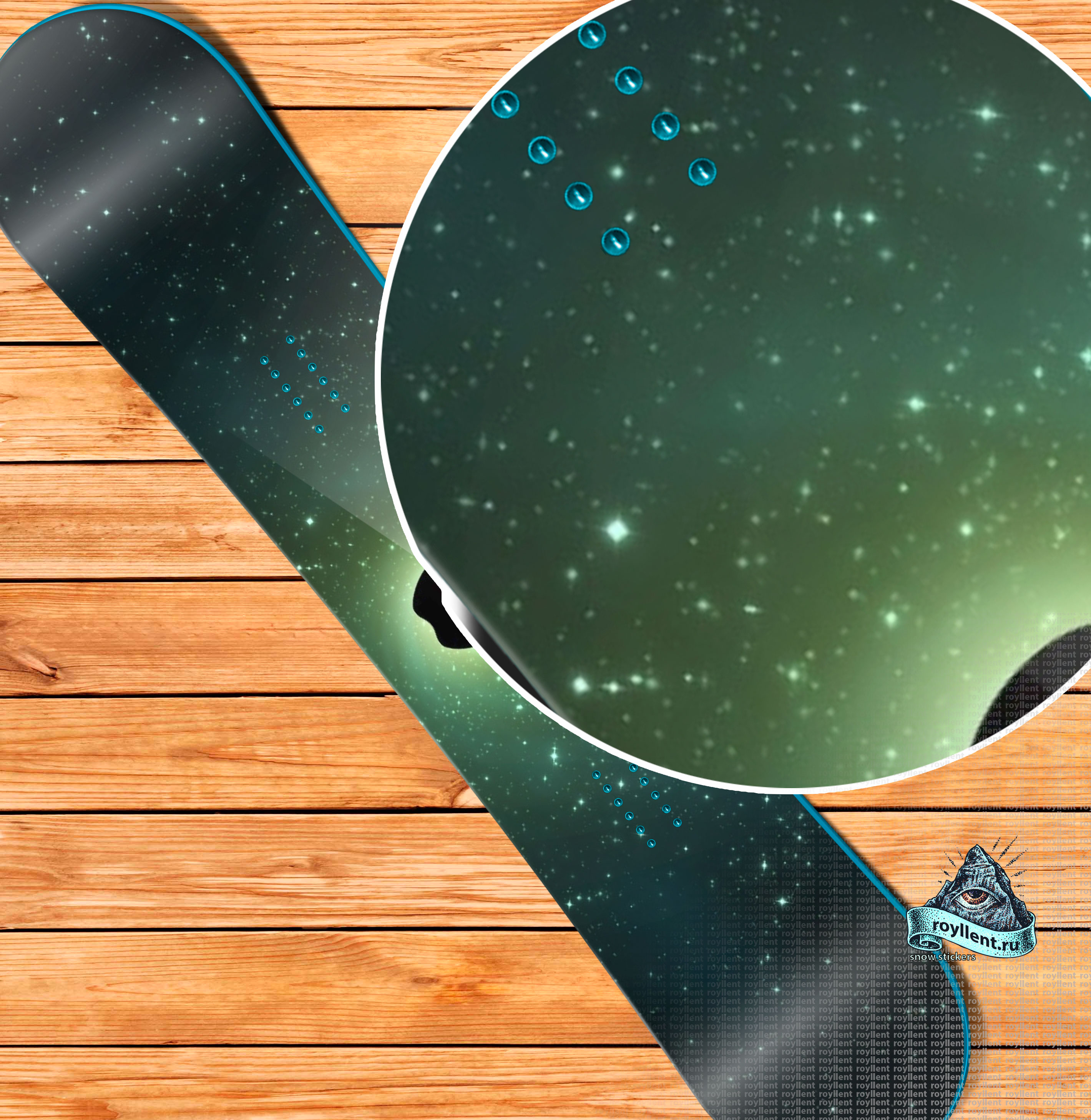
У вас может быть доска с виниловой наклейкой в стиле Royllent 2017 Apple Logo Galaxy Design
Это потрясающее решение позволяющее вам выделиться из толпы всех остальных, так как вероятность встретить доску с так же рисунком равна нулю. Каждый раз при изготовлении мы следим чтобы клиентам нравились наши продукты.
Нанеся рисунок на доску, вы всегда в центре внимания, и если вы фанат стиля Apple — это именно ваше решение, для вашей доки.
Пару слов о дизайне в стиле Apple :
Название фирмы происходит от англ. apple («яблоко»), изображение яблока использовано в логотипе.
До 9 января 2007 года официальным названием корпорации на протяжении более 30 лет было Apple Computer, Inc.. Отказ от слова Computer в названии демонстрирует смену основного фокуса корпорации с традиционного для неё рынка компьютерной техники на рынок бытовой электроники.
- Имя Apple Джобс предложил из-за того, что в этом случае телефонный номер фирмы шёл в телефонном справочнике прямо перед «Atari».
- Macintosh — сорт яблок, продающийся в США, — любимый сорт яблок Джефа Раскина, который был руководителем и разработчиком проекта Macintosh перед тем, как эту должность занял Стив Джобс.
Designs on design
Design is a series of decisions. Should it be this color or that color? What’s the first thing you see when you log in? What happens when the user clicks here?
Sometimes these questions are really hard to answer, and the easy solution is to make it a preference for the user to decide instead. But the best designers tend to view such options as admissions of failure. Where Apple differs from its competition isn’t in aesthetic beauty, it’s in the company’s ability and willingness to make decisions on behalf of its users.
It was easy to think of a music player as MP3 files on a hard drive, and thus present users with a folder structure. What Apple did was break the product down not by how the technology worked, but by how people worked. This was the company’s approach with the first Macintosh, and can be seen in the latest iPad mini. During the periods when Apple has been most successful, it’s had focused product lines created and built by dedicated people who cared about making the right decisions.
The open source community behind Linux instead chooses to focus, it seems, on pushing core technology forward—the nuts and bolts. The world will always need that perspective, but the megahertz race is over, and it was won by the people who just wanted to check their email and surf the Web without having to think too hard about what they were doing.
While RIM was busy making BlackBerries that appealed to network administrators, the people who actually have to use the things were going out and buying iPhones. No surprise, then, that the next great leap forward in technology was the removal of the keyboard and mouse. What could be more human than touch?
Linux and its cousin Android win with hobbyists and technology enthusiasts by providing options for everything. Like software development itself, the use of an application becomes a flow-chart of possibilities. Where, then, is the line between configuration and programming?
Apple’s take is to remove complexity and make choices long before the user sees the product. For some, this feels like control is being taken away, and they accuse Apple of dumbing down their products, presumably giving us the old cliché that Apple products are for dumb people. For those of us who prefer technology with a human touch, the magic is in what we can accomplish. Our tools are extensions—not reflections—of ourselves.
We are in the early days of a design renaissance. Apple, with the iPod and everything that came after, has proven that simple, attractive, useful products can win. The effect on third-parties is dramatically evident in the iOS and Mac app stores, not to mention in competing products—but it’s also spilling over into unexpected places. Square and Simple are changing the world of finance by focusing on the human end of the equation. Nest started over and reinvented the household thermostat. And it’s only going to get more interesting as a generation of kids who grew up with iPods and iPhones decides that it wants to create things that change the world.
For decades, some very smart people have spent a lot of time and invested a lot of energy into making people understand technology. It turns out that the real secret to making computers usable is to make them disappear. Our humanity is finally catching up with our technology.


